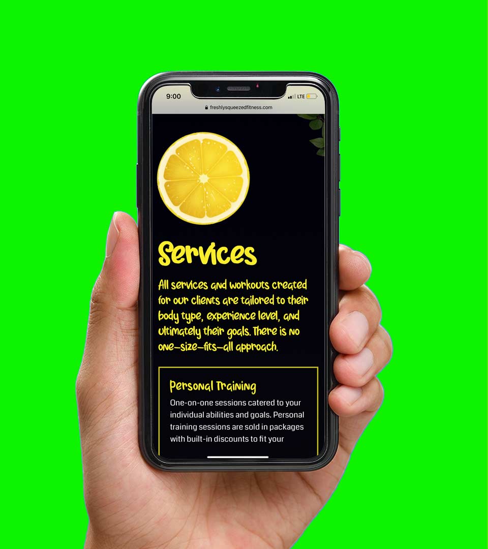
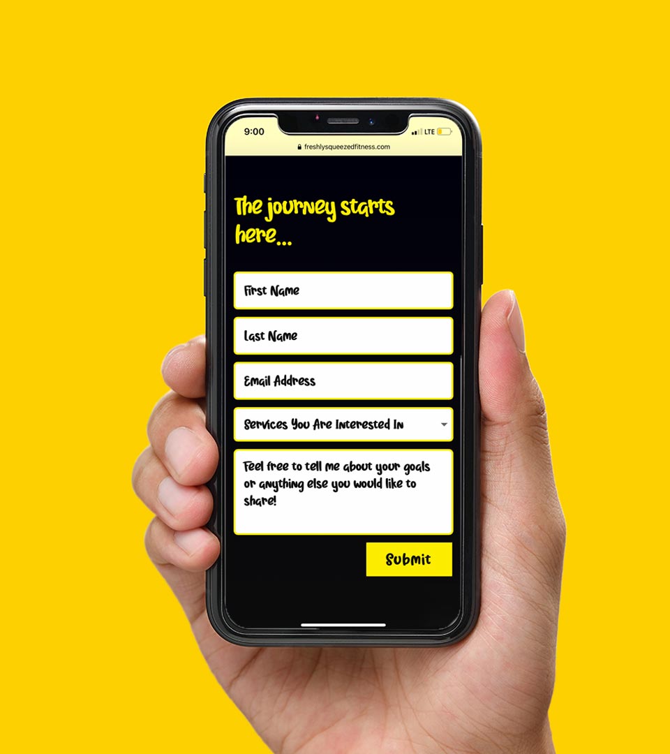
FSF website
Branding | Web design | Copywriting
Katlin Lemon, owner of Freshly Squeezed Fitness, is shaking up the fitness scene in her hometown of Raleigh, North Carolina. I was given the task of building her website to resonate with an audience tired of the everyday gym routine, ready for a unique personal training experience. Beyond the website design, brand style guidelines were developed, including a color palette and typography, all while maintaining a simple and exciting user experience. Read below to see how it all came about.
The situation
Develop a unique online fitness brand.
My first meeting with Katlin Lemon, founder of Freshly Squeezed Fitness, was as exciting as the brand she wanted to build. Fueled by a passion to make fitness seem less like a burden, Katlin’s story was both genuine and inspirational.
For far too long (and to this day), the average gym experience can be considered mundane, burdening, and evoke a sense of duty rather than excitement. Katlin is on a mission to change this – providing her clients a fun, friendly, judgement-free fitness program.
She wants everyone to feel welcome, like this is their time to destress, work on themselves, and forgot about the outside world, even if for just a short time. When a client focuses on the “feeling” they are trying to portray, the work becomes pretty exciting. After all, anyone can put up stock images of people working out on a website. But creating a feeling that evokes an emotion on the web? Now that’s where the magic happens.
Primary Color Palette
The strategy
Excite, educate, and then excite some more.
From the onset, Katlin told me two things: 1) she wanted a one-page website and 2) her message was simple: “I want people to get excited about working out.” A simple, yet inspiring statement that established the website’s groundwork and empowered me to push the envelope of creativity. From the typography to various illustrations, the look and feel of Freshly Squeezed Fitness needed to portray fresh, fun, and fit. The challenge was creating a balance between the text and imagery, being careful not to let design outmaneuver the function of the website. With each element there needed to be a balance of light, playfulness that transferred over to the information being conveyed.
In addition to branding and design, a well-thought out content strategy was crucial to the experience of Freshly Squeezed Fitness. We wanted to create an atmosphere where judgement and pressure go out the window. Being intentional (and thoughtful) about the copywriting was crucial to driving that sentiment home.
The outcome
An engaging website with a refreshing twist.
The Freshly Squeezed Fitness website feels fun, dynamic, and as fresh as the lemon-squeezed logo itself. The yellow color, often associated with happiness and optimism, was used to capture people’s attention and evoke a sense of excitement. Original photography and distinct typography further lent in capturing the light, playful atmosphere that we wanted to create for the website and brand.
The layout of Freshly Squeezed Fitness also followed a strategic layout. I designed the site to fit the feel of a brochure, each section intended to resemble a lemon, and unfold a new part of the business. The testimonials, were purposefully put toward the tail-end of the website, providing the social proof visitors needed to fill out the contact form.
I was both humbled and proud to bring Katlin’s vision to life. With bright colors and inviting text, you can tell your workout (when joining Freshly Squeezed Fitness) is going to be less stressful and more enjoyable.


My m.o.
Make real connections and a difference wherever I go by listening and learning about people’s lives around me.
My favorite quote
"You can't change the world, but you can make a corner of it pretty nice." — William Chapelle
Connect
© 2022 Matthew Derreck Peters
