Blog No. 3 | April 15, 2022
15 new 404 error pages in 2022 you’ve never seen
So, just to add some context and a little backstory to why I wrote this blog and how I got here.
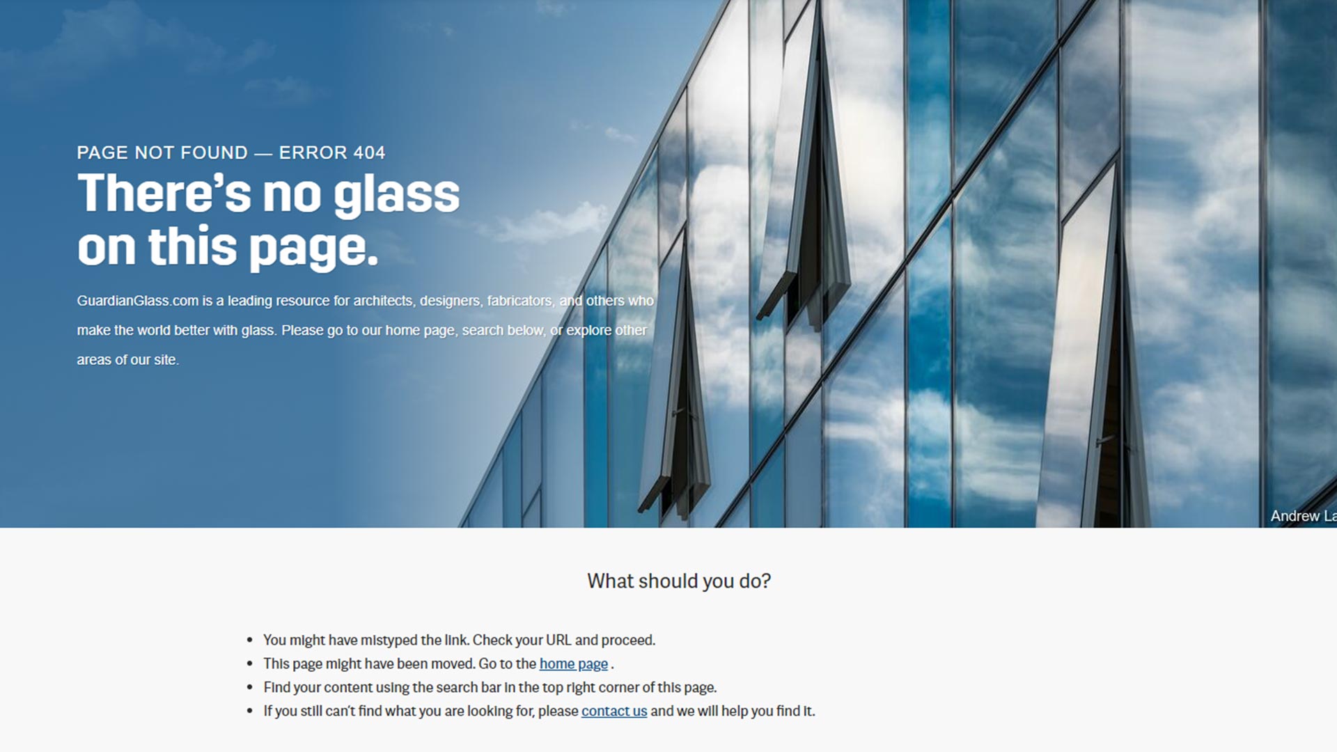
If you don’t already know, I work for a chemical coating manufacturer in the glass industry. Crazy stuff, I know. Well, while looking around to learn about the various types of glass manufacturers offer in the industry, my research led me to Guardian Glass – a global glass manufacturer. After poking around their site, I hit a link that no longer existed, which led me to their 404 error page (example #1 seen below). The page wasn’t just like any other 404 error you get. Guardian had actually taken the time to design the page, using content and imagery that aligned with the Company’s brand.
Consequently, this got me thinking: a 404 error page shouldn’t be wasted real estate on anyone’s website it should be a place for companies to showcase their brand.
Of course, first and foremost, the function and goal of any 404 error page should be to point people back to your site, with links that are visible and clear-cut. However, beyond that, a 404 error page can also be a great way to inject a little humor, whit, and/or humanness to your brand. After all, no one likes seeing an error page, so making it seem less like an error and more of a “oops, let’s fix that…”, might score you some extra branding points.
Disclaimer: The examples of the 404 error pages seen below are of actual websites I’ve come across, ranked in no particular order. They’re not samples I’ve taken off some previously written blog like HubSpot (though I do highly recommend checking out their 404 error page), and they’re especially not examples I’ve snagged off Google Images. My hope is that they’ll inspire you when creating your next 404 error page.
What I like about it: The 404 error page on Guardian’s website is clean, intentional, visually stimulating, and offers popular links that users can use so they can get back to looking at glass. I especially love the messaging they use, “There’s no glass on this page.”, which subtly notifies visitors they are in the wrong place.
What I like about it: If you know anything about Really Good Emails (RGE), then you know how fun and modern their brand is. Their 404 error page follows suit. The page plays off the popular Netflix Series, “Stranger Things”, with the theme revolving around Barbara going missing. Right on cue for visitors who land on this page, letting them know that “something” is missing, and that they need to get out of their quickly using the home page link. It’s pretty genius and very well executed. Poor Barbara…


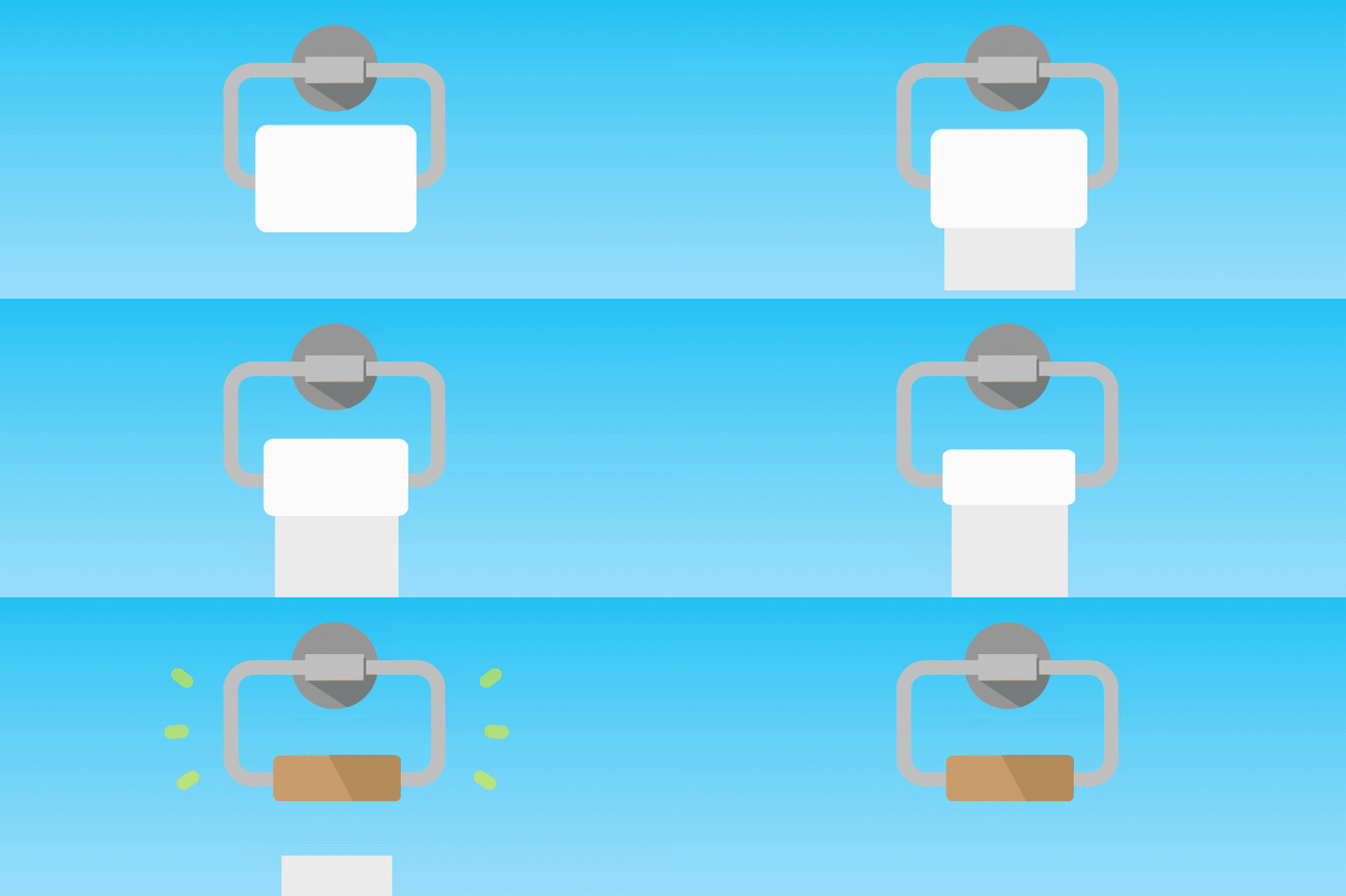
What I like about it: As you would expect, Charmin’s 404 error page is cute, playful, and aligns perfectly with the rest of the site’s branding. From the messaging to the light blue color, Charmin uses words like “uh-oh” and “tp-friendly”. There’s also a nice animated gif of a toilet paper roll that is at the core, letting visitors know there is nothing else for them to see here and to get back to a tp-friendly site.

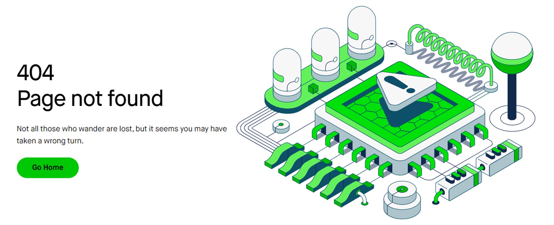
What I like about it: Robinhood’s 404 error page is a good reminder that a simple branded image coupled with a clever message can do the trick. And if you know anything about Lord of the Rings and the wisdom of Gandalf, then you’ll know the famous line of “Not all those who wander are lost.” However, they do suggest that you may have taken a wrong turn, prompting visitors to go back home with a big green button.
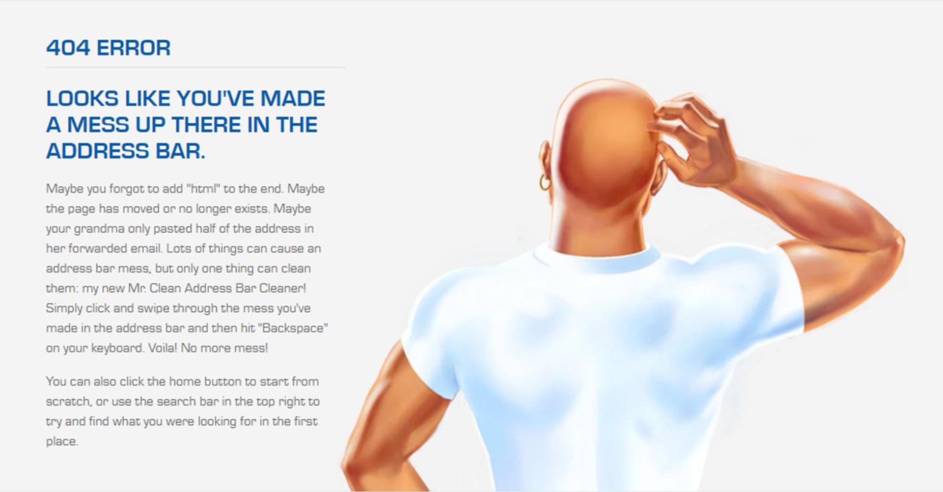
What I like about it: My personal favorite among the 404 error pages is from Mr. Clean. The page first captures your eye featuring a strong-looking man with a bald head in a tight white tee, unmistakenly Mr. Clean, looking back and scratching his head in confusion. This imagery quickly plays on the fact that he, and the brand, are just as confused as you are, evoking humor in light of the situation. Taking it further, the headline plays on the purpose of the brand stating that the user has made a mess and it needs cleaning up. Did someone say “clean up on aisle 4….04 please”? Mr. Clean is dying to help you clean up the mess, with the copy suggesting multiple ways to correct the issue, or rather “tidy” things up.
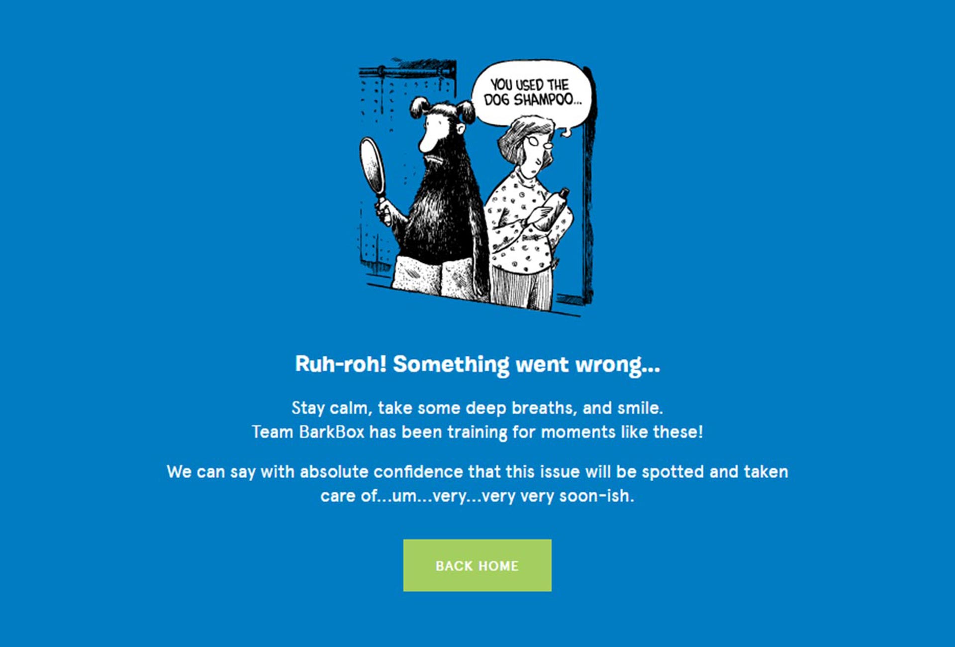
What I like about it: The 404 error page from Barkbox is a great example of how humor and interesting imagery can stop users in their tracks, despite landing on the wrong page. But it doesn’t stop there. The headline and accompanying body copy also takes a on a lighthearted tone that reminds users to stay calm, bringing a degree of levity to an otherwise frustrating situation. Kudos to the Barkbox design team for the hilarious animation.
What I like about it: Computer gaming giant, Razer really hit the nail on the head with their 404 error page. They leverage their brand, logo, and company mascot, “Sneki Snek”, to show users they are in the wrong place. Poor Sneki Snek is clearly confused and a bit worried as to where it is, so Razer guides users to take this cutie (and yourself) back to the home page. Moral of the story, if your logo or brand can be used to tell a story, try it out!


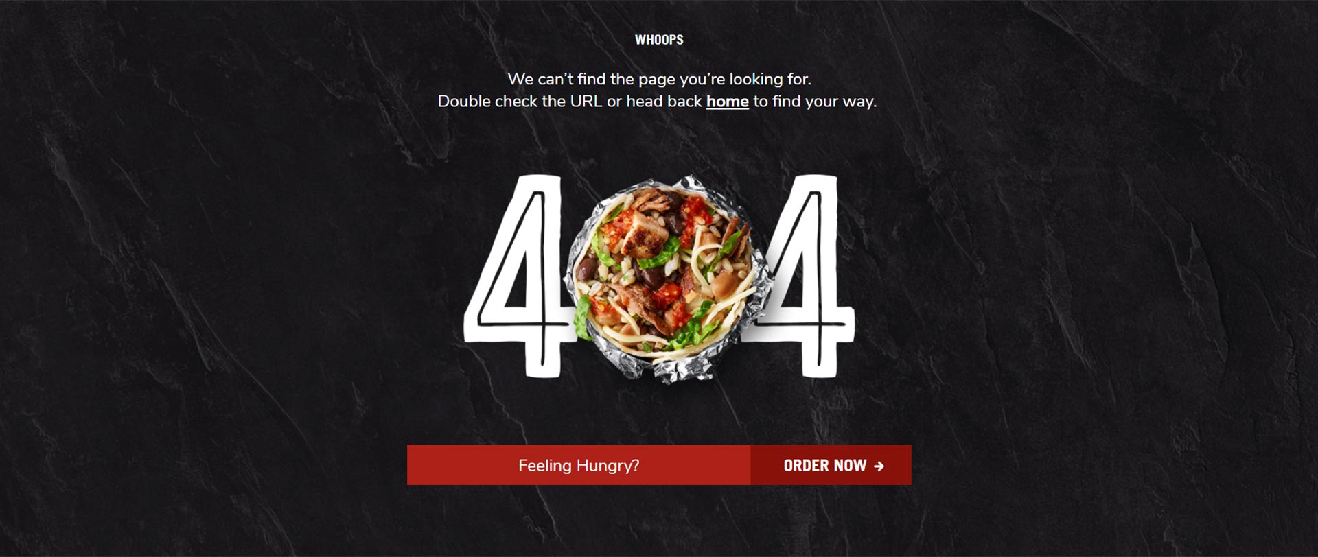
What I like about it: Chipotle’s 404 error page is a great example of how to show visitors they are in the wrong place, while simultaneously getting them to back to your site to start buying. From the delicious looking burrito to the accompanying call-to-action (CTA), Chipotle does a great job playing on people’s hunger emotions. Whoever says a 404 error page couldn’t or shouldn’t be used to promote your product or service is wrong. Well played, Chipotle. Well played.
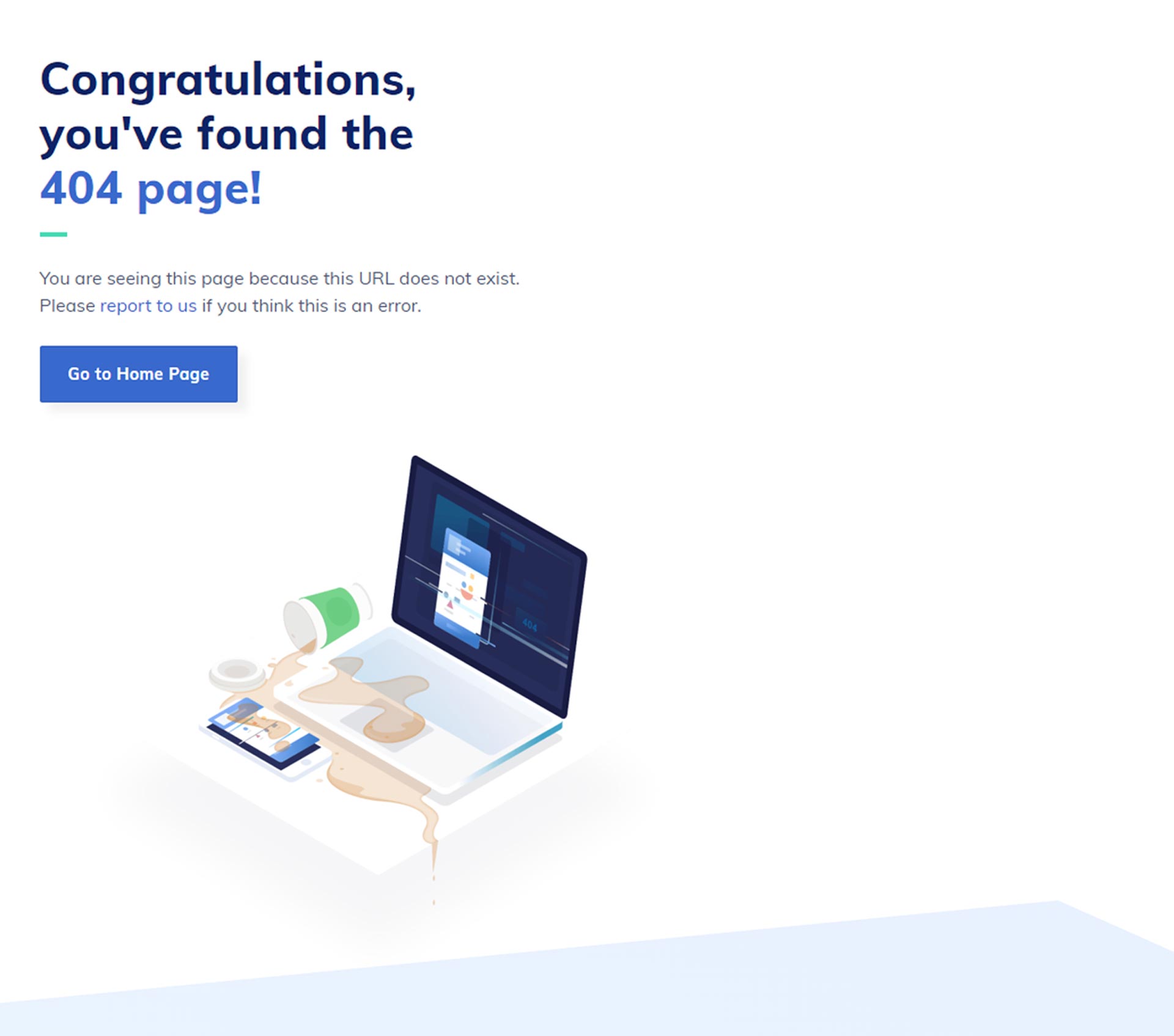
What I like about it: Contrary to most 404 error pages, Razorpay goes against the grain and actually congratulates visitors for finding theirs. What I love most about this approach, is that it keeps visitors from thinking they’ve made a mistake, but instead brings light to the situation with some witty, sarcasm. Of course, to make things right they do provide a link for users to go back to their home page.
What I like about it: When you land on Emma’s 404 error page, you are met with a headline, some body copy, a rather unusual video in the background, and a button that leads people back to their home page. Okay, great, seems like standard protocol. But if you decide to linger around, Emma incorporates a bit of unconventional humor to their 404 error page, by allowing visitors to click the space bar and have some fun watching a few random videos play in the background. Talk about a great way to turn your 404 error page into a promotional piece that allows people to get people get familiar with your brand. Seriously though, click the link above and try it yourself.
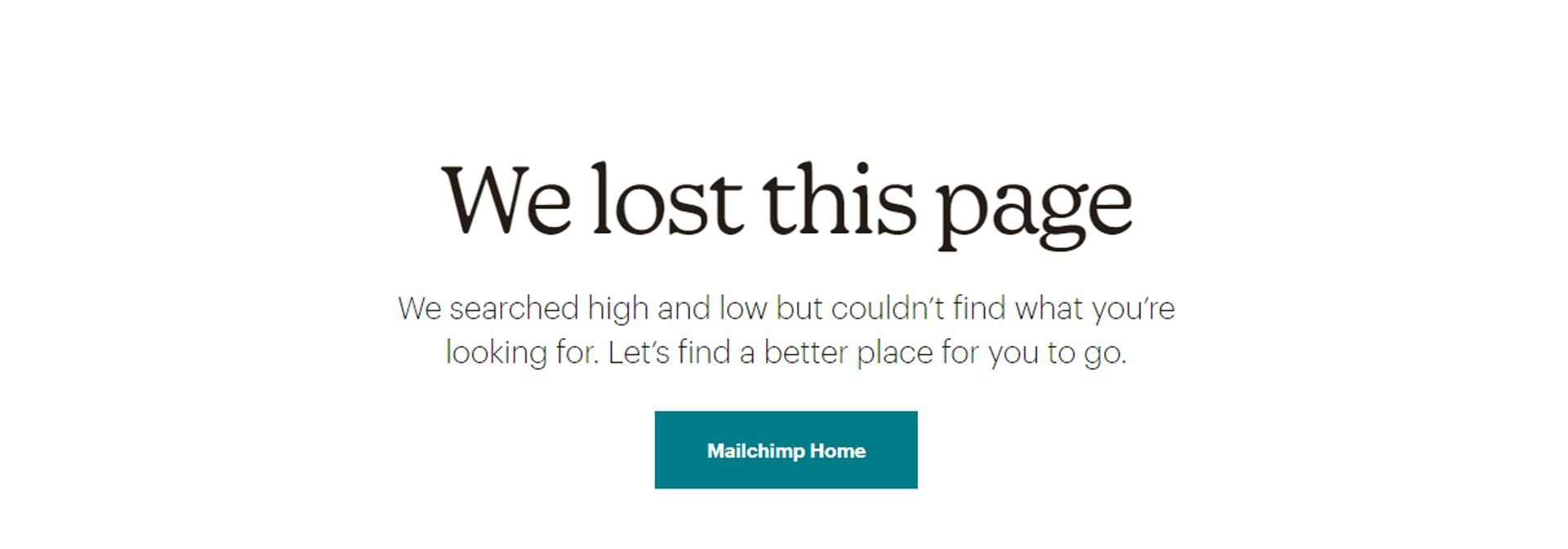
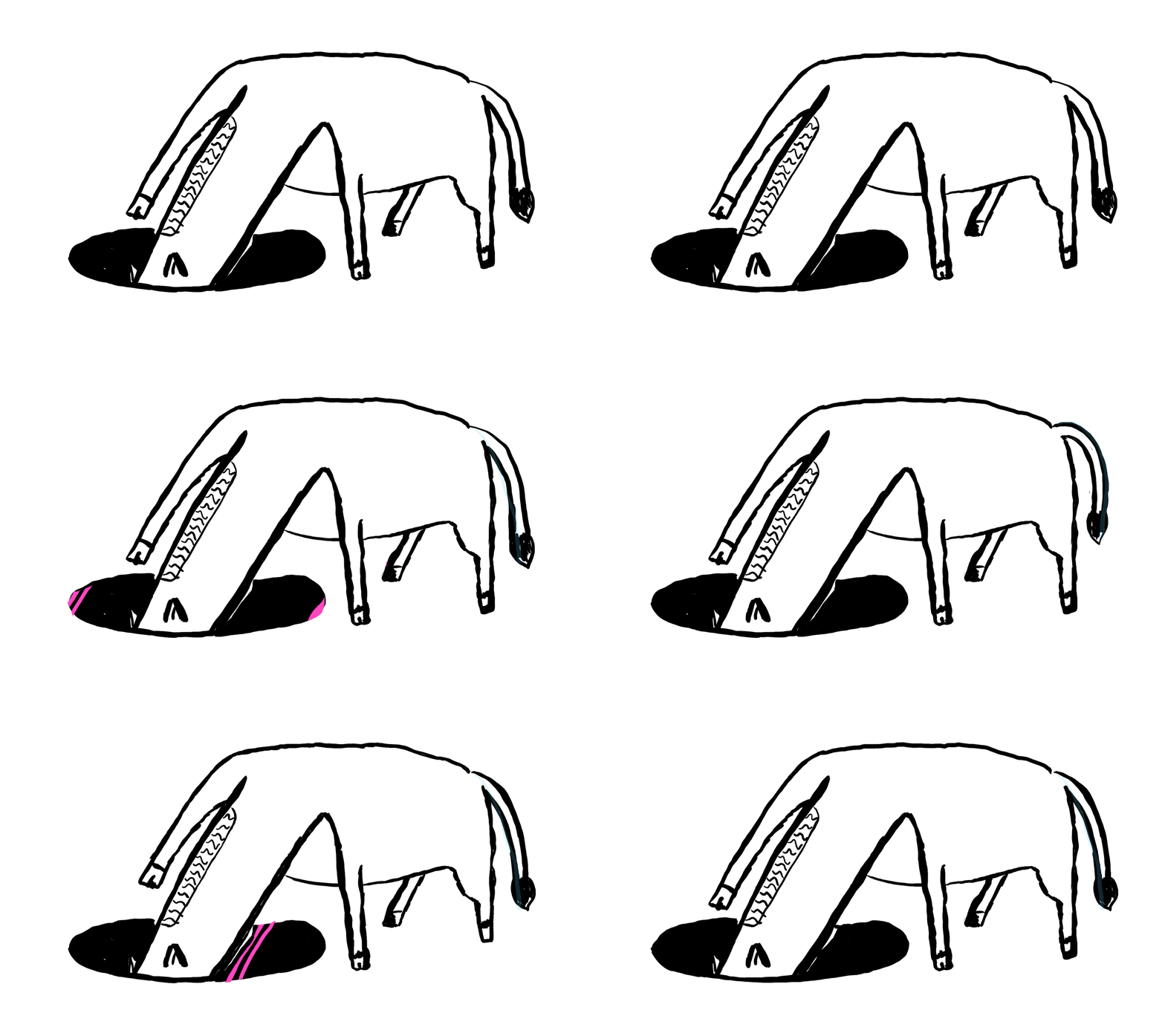
What I like about it: Similar to Emma’s 404 error page, email marketing giant, Mailchimp, masters the art of creativity with their page. From the headline and body copy to the abstract visual of the donkey looking for the lost page, Mailchimp provides visitors a unique viewing experience on their 404 error page. Also, untraditional to most headlines, Mailchimp humbly assumes responsibility for the lost page, which is yet another way companies can mitigate frustration from users who visit their website.
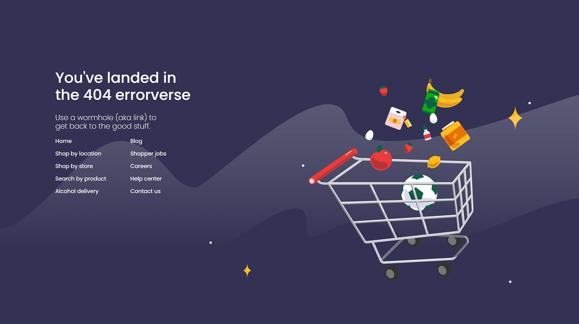
What I like about it: Before the Metaverse, there was (and still is) the 404 errorverse – the place users land when clicking a link on Instacart’s website that is no longer available. The page is thoughtfully and creatively put together, which despite the image below, is an animated gif that shows a variety of groceries floating through midair, just like the people who land on the page. Instacart quickly gives visitors a way out, using a wormhole through a variety of links that get them back on their buying journey. Check it yourself for the full effect.
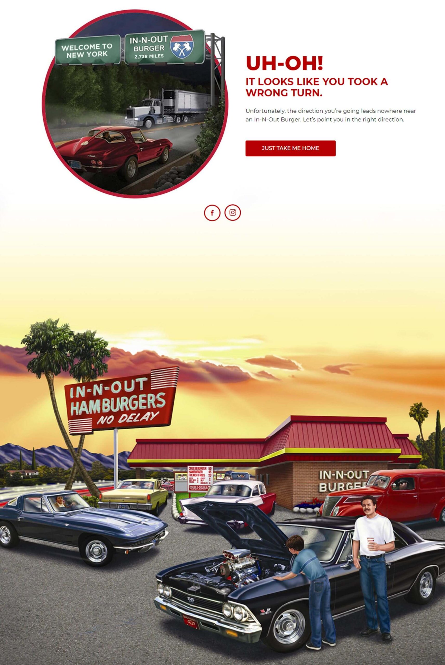
What I like about it: For businesses that are location specific, I highly recommend checking out In-N-Out Burger’s 404 error page. Originated and local only to the West Coast, the fast food giant lets website visitors know they are in the wrong place with an image of an overhead sign that says the nearest In-N-Out Burger is 2,738 miles west of New York. And if that isn’t enough, they also slap a big “UH-OH” headline in red with a button that takes users back to their homepage. Altogether, a fun way to turn your 404 page into something users can get a kick out of.
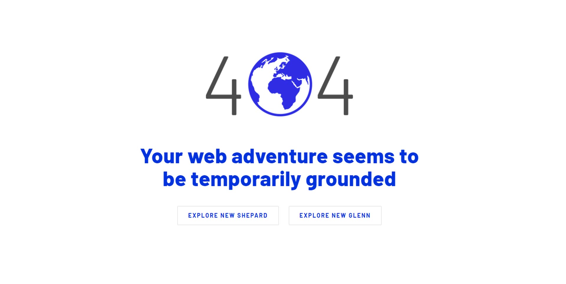
What I like about it: Ever heard of Blue Origin? It is billionaire Jeff Bezo’s aerospace company that pretty much wants to put people in space. As exciting as that sounds, you want to know something that excites me even more? Yup, you guessed it – their 404 error page! Following the space theme, the team at Blue Origin uses the globe of Earth and a clever headline to inform visitors they’ve been temporarily grounded, aka in the wrong area. They also supply two links to their most popular rocket ships.
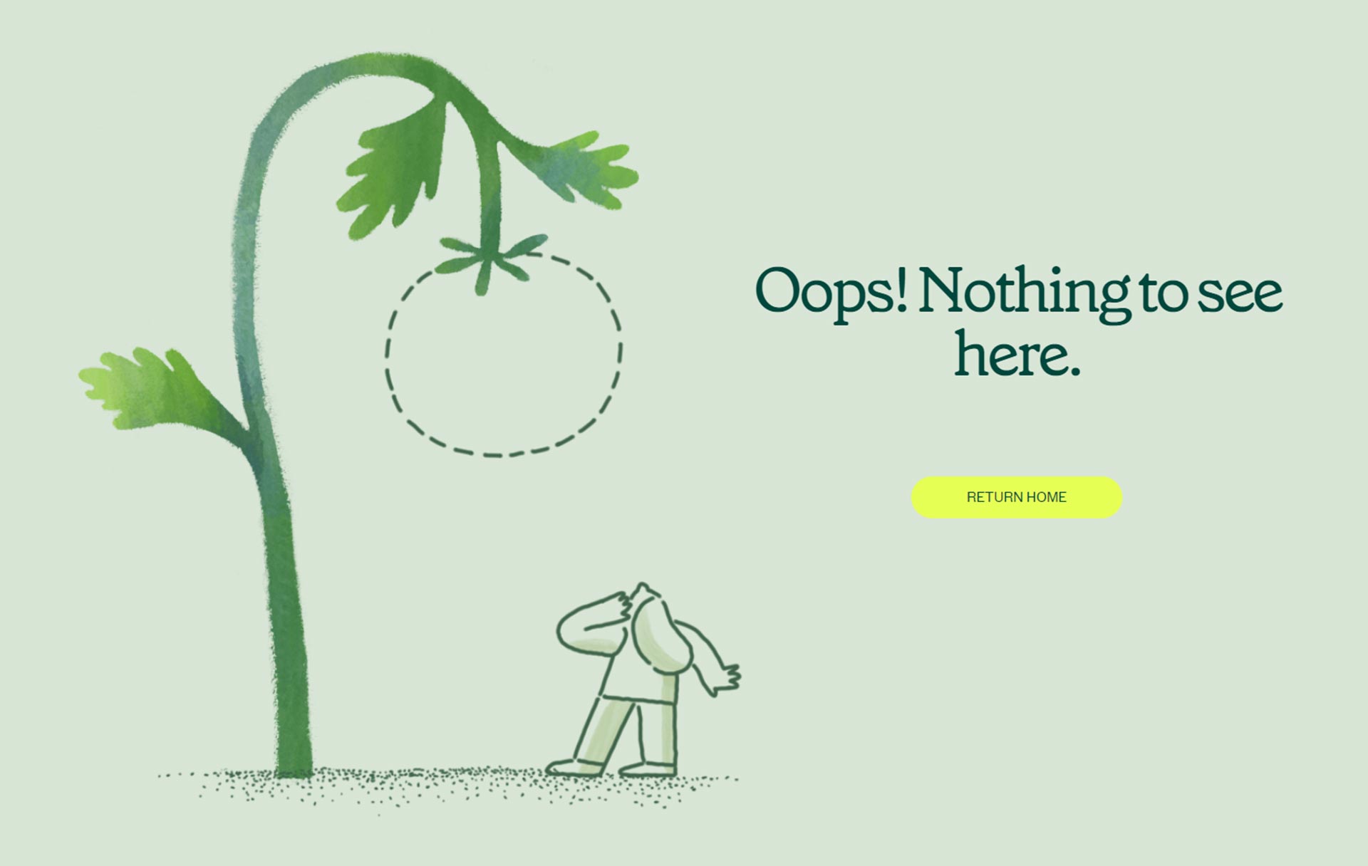
What I like about it: Sweetgreen’s 404 error page is simple, yet still manages to sneak in some clever imagery. The cut out line of the tomato clearly implies that the vegetable is missing, just like the page visitors are trying to reach. This is a great example of how 404 error pages don’t need detailed imagery or videos to get the point across. In a lot of cases, a metaphorical image with some simple text can go a long way.
Final thoughts
When done correctly a good 404 error page could be the difference between annoying visitors (regardless of whose fault it is) and making them grow fonder of your brand. While it’s inevitable to deter users from landing on your 404 error page, you can definitely make the experience more enjoyable by injecting some humor and creativity.
I would even argue that when done thoughtfully, your 404 error page can be used to promote your brand and give prospects more reason to buy your products or service.
Think of how you can use your logo, incorporate your graphic illustrations, and use your brand’s tone to create your 404 error page. Nothing is off limits, so don’t be afraid to try something new. Refer to the examples above for some inspiration and let your creativity take over.
Post-honorable mentions
Since writing this blog post, I have since come upon a few 404 error pages that I didn’t want to slip by. So, in the name of fairness, and to give credit where credit is due, I’ve included a few extra links to some websites who have done a great job with their 404 error pages: Netflix, ShipBob, Southwest Airlines, and Avocode. On final note, I will continue to update this blog to continue to showcase the funniest, freshest 404 error pages out there.
Last updated: 01/15/2022
My m.o.
Make real connections and a difference wherever I go by listening and learning about people’s lives around me.
My favorite quote
"You can't change the world, but you can make a corner of it pretty nice." — William Chapelle
Connect
© 2022 Matthew Derreck Peters
