Blog No. 2 | Feb. 24, 2022
11 of my favorite emails that “landed” in my inbox from JetBlue Airways in 2021
In the world of airlines, JetBlue Airways is the gold standard. Their flights are smooth, the snacks are delicious (and plentiful), the legroom is spacious, and their prices are amazing. From an operational and customer service standpoint, they crush it on every angle.
But what you might not know (unless you are an email freak like me) is how clever, on-point, and witty JetBlue’s branding is, specifically their email marketing. I might go as far as calling it legendary. From seasonal deals to last minute boarding information, their email marketing team serves up a wide variety of emails that are timely, on-point, easily digestible, and extremely witty.
So, to show you why my head is so high up in the clouds, I’ve compiled 11 of my favorite email campaigns I received from JetBlue in 2021. I hope you enjoy them as much as I do and/or that they can inspire some creativity in your own email marketing.
Side note: the emails are in descending order starting from December of 2021.
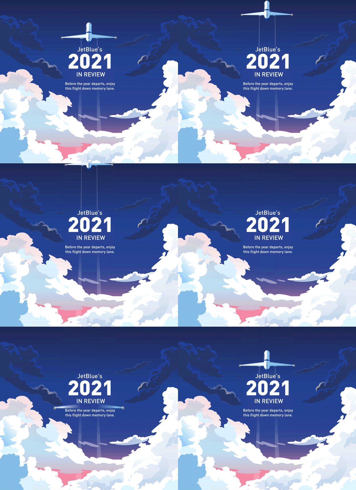
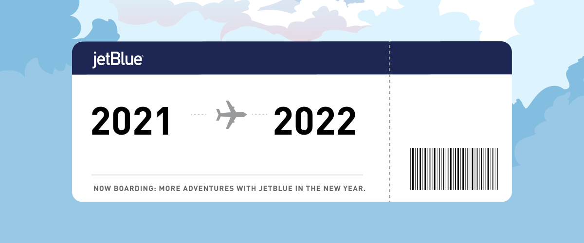
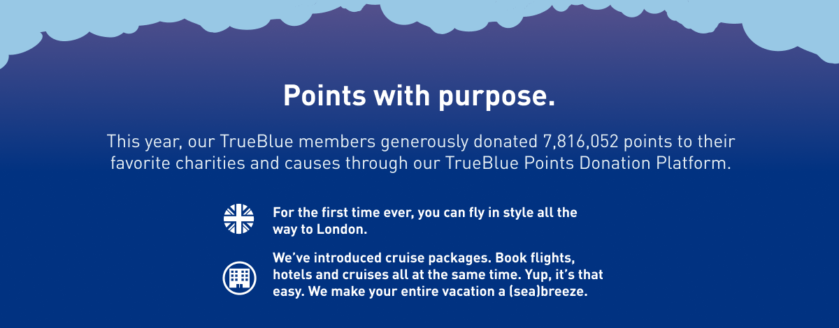
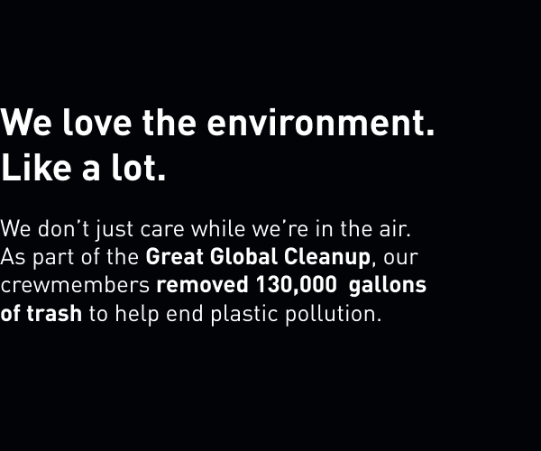
1. JetBlue’s 2021 in review
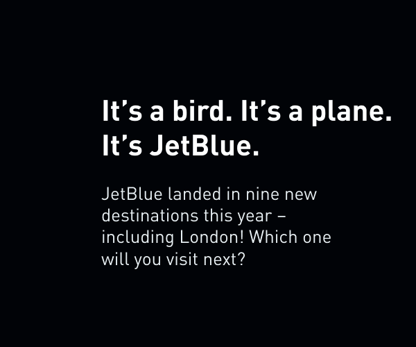
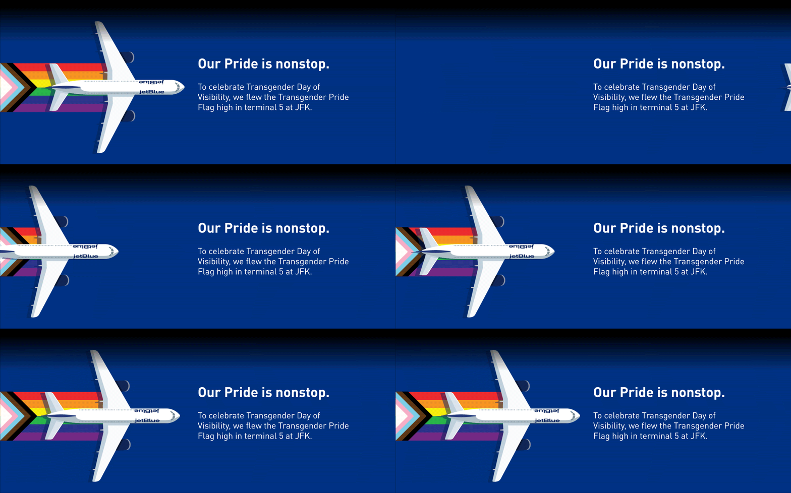
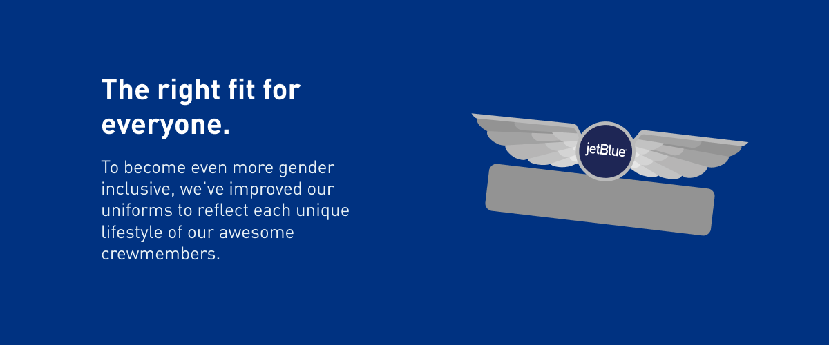
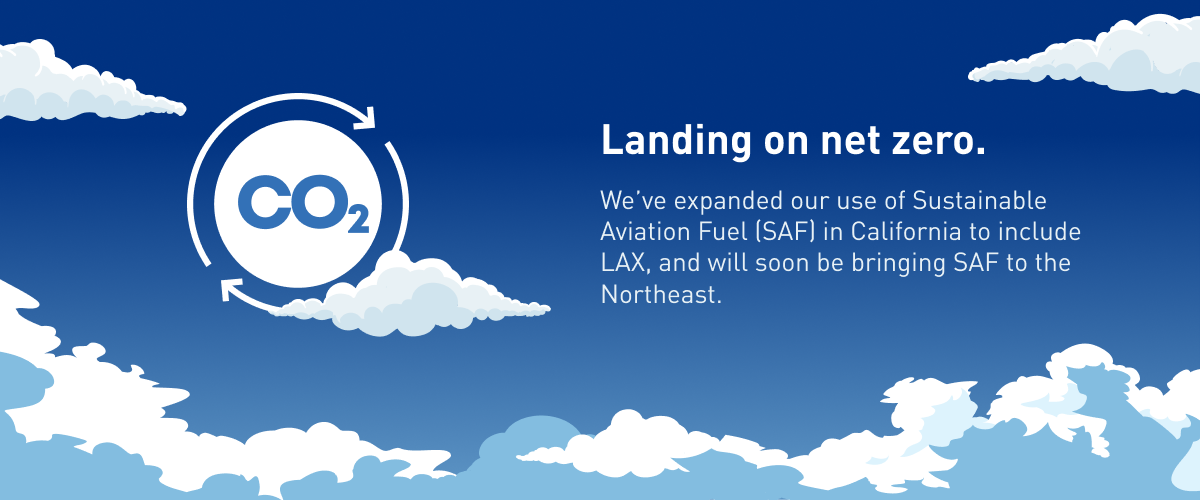
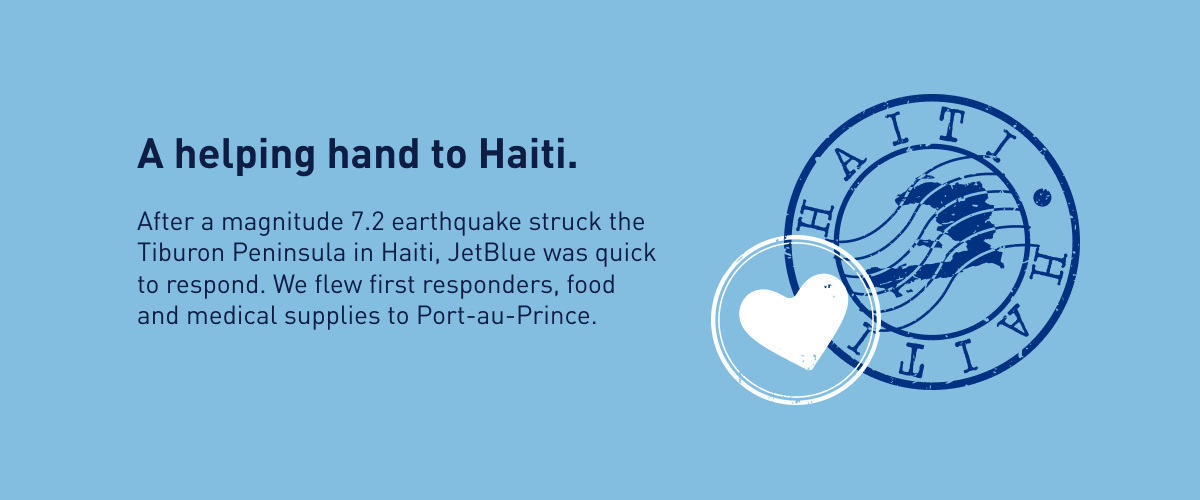
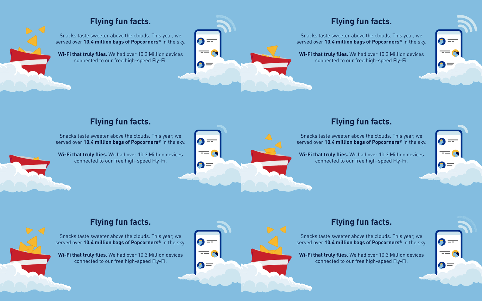
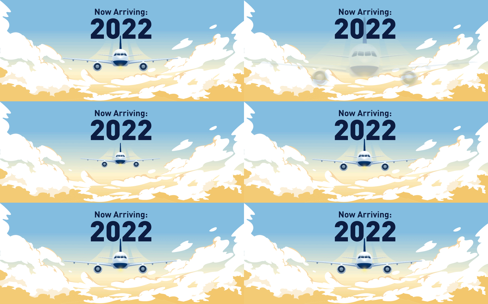
What I like about it: If you are like me and like to see end-of-the-year recaps, then you’ll love this 2021 review from JetBlue. From the clever headlines and stimulating visuals to the quick-hitting and amazing imagery, this email champions everything JetBlue represents. And let’s not also forget about the simple subject line that kicks the entire campaign off.
Date sent: 12/31/2021




2. Sail-ebrate savings with flight + cruise packages
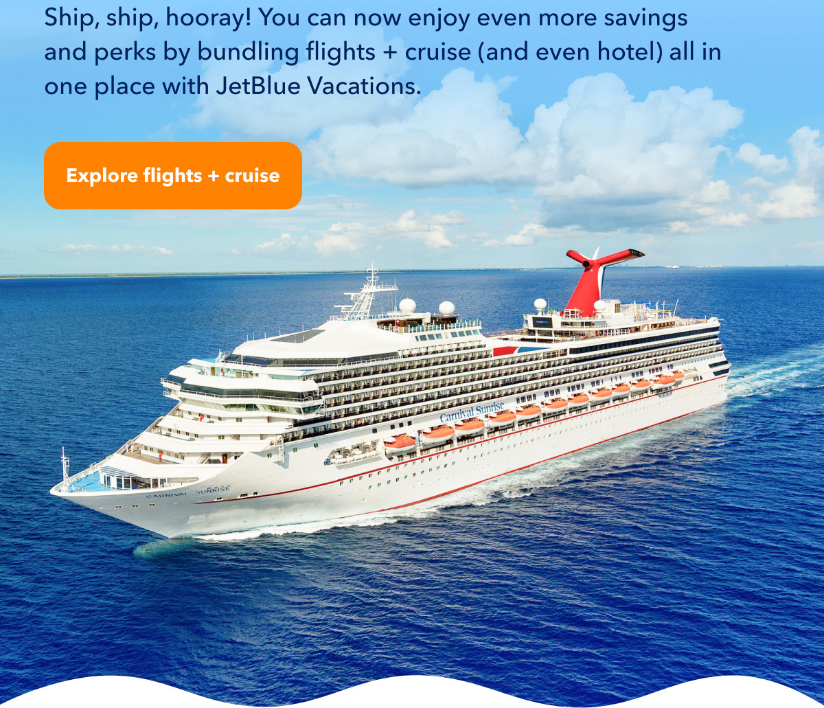
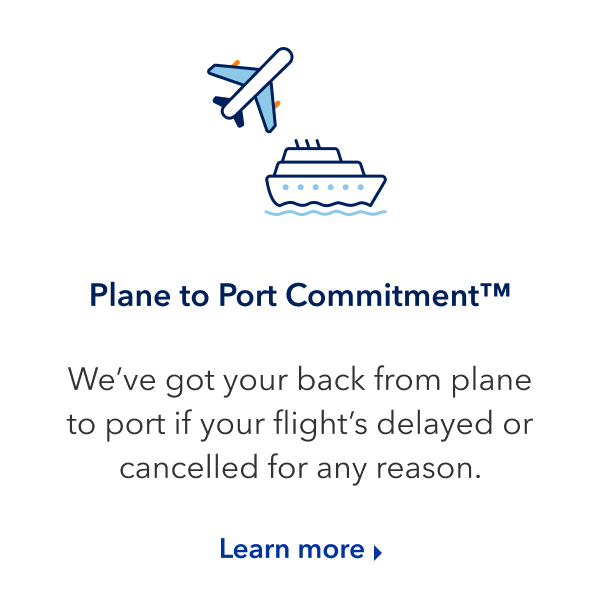
What I like about it: This “sail-ebrate” email campaign from JetBlue is the right amount of everything. The headline demonstrates a clear value proposition (while still incorporating the JetBlue brand we’ve all come to love), the body copy provides more details, and the call-to-action (CTA) stands out from the rest of the email, inviting users to click the button. Add a little confetti to the top, with extra details about the vacation below, and you have yourself a pretty compelling email campaign.
Date sent: 10/19/2021




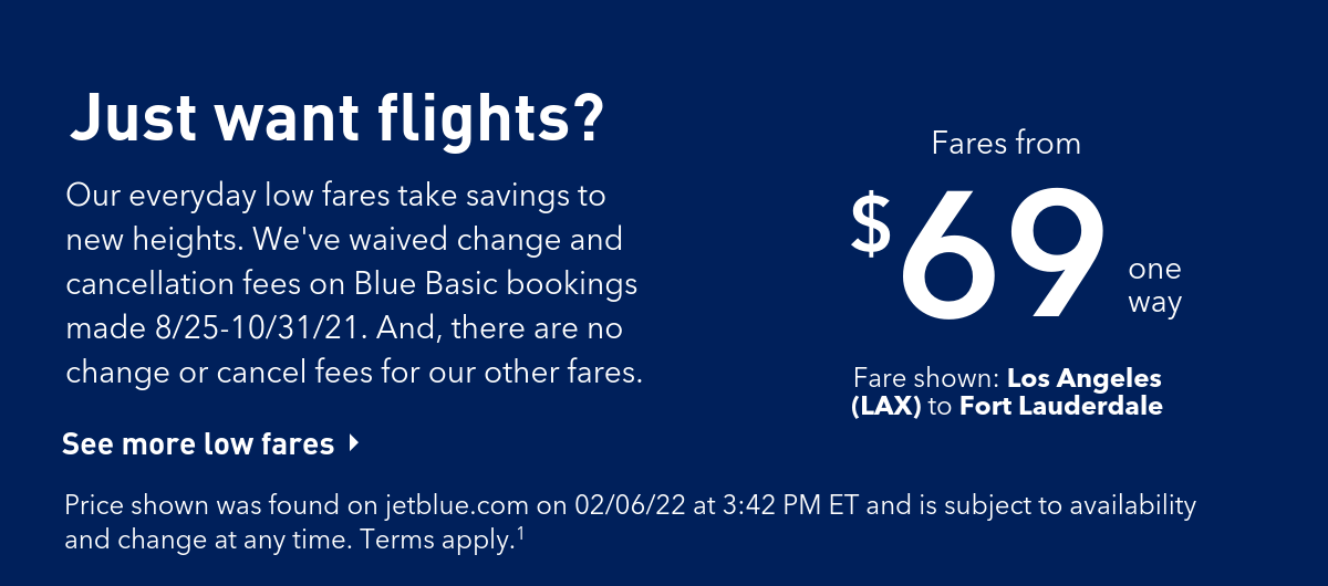
3. Jet away
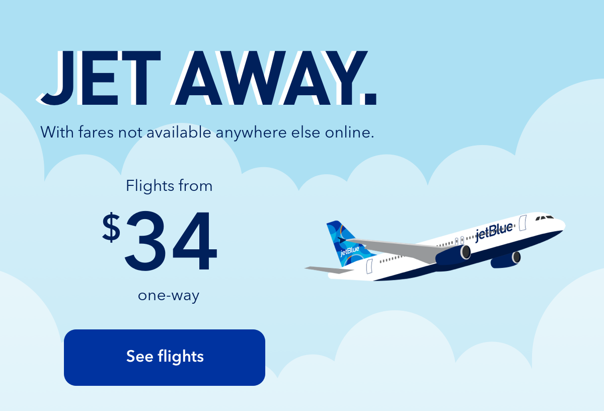
What I like about it: In a world where we get bombarded with emails by the minute, often times simplicity and clarity speak the loudest. That is exactly what this email campaign from JetBlue accomplishes. A simple, yet clever headline, followed by powerful supporting text, and a CTA (button) that is impossible to miss. Though if it were up to me, I would have changed the CTA to something like “Book your trip” or “Get flying”.

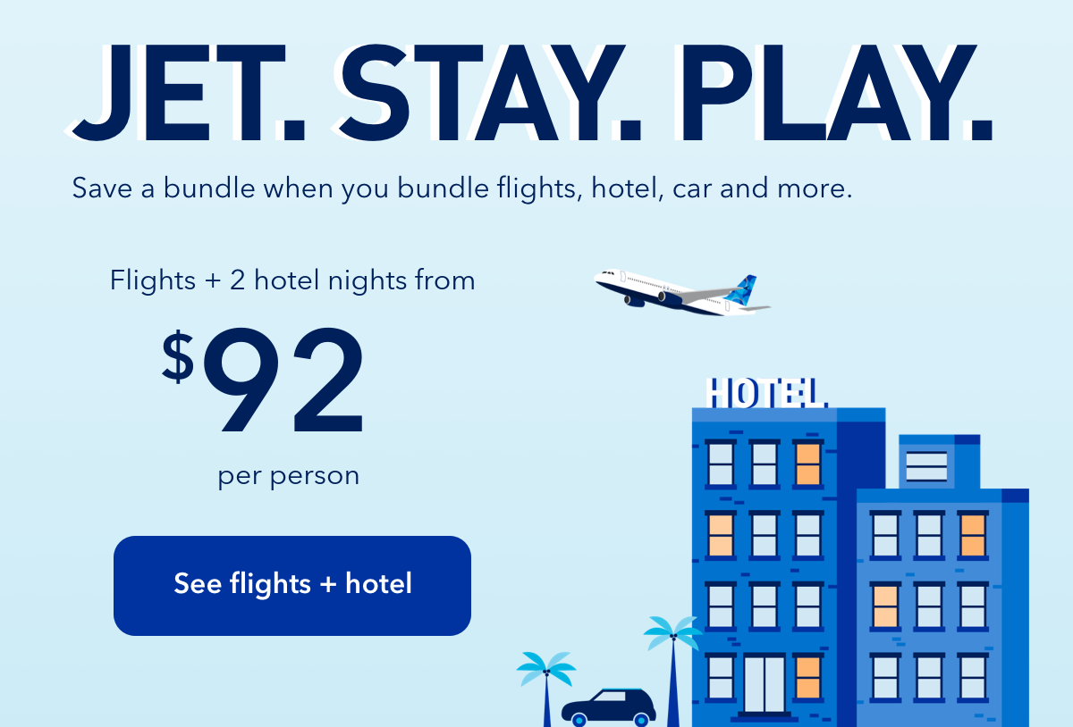


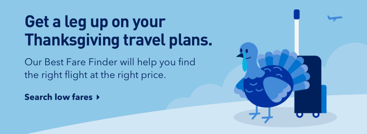
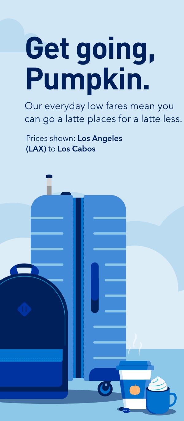
4. Get going, pumpkin
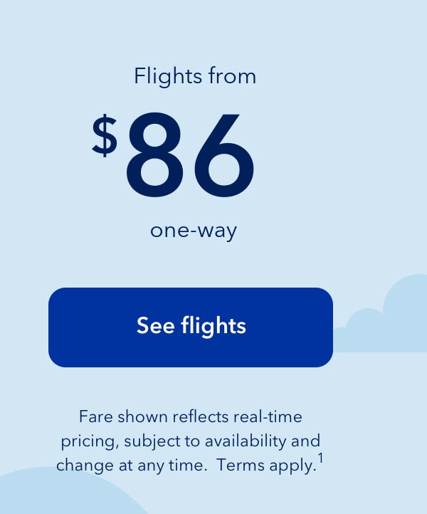
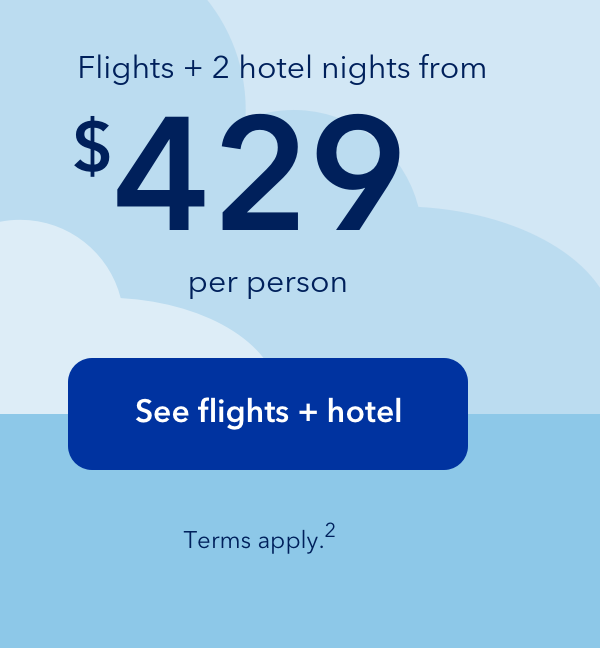
What I like about it: In preparation for the Fall season, JetBlue sends out this timely email filled with little goodies throughout. The headline skillfully and indirectly addresses users while prompting action and the body copy keeps the fun going with some fall-flavored text. What I also love about this email is the two column layout, atypical from commonly stacked email designs. Finally, let’s not forget the subtle placement of the pumpkin spiced latte, that signifies Fall, indeed, is in the air.
Subject line: Spice up your Fall, Los Angeles



5. Book smart
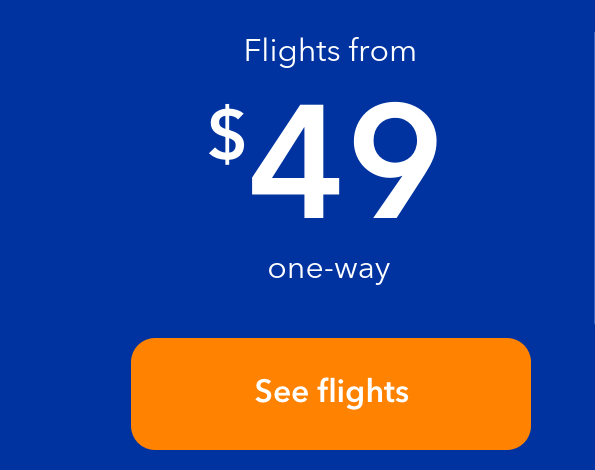
What I like about it: Setting the stage with the subject line, this email by JetBlue cleverly uses school as its main theme. It starts with the headline playing off the popular phrase “Book smart”, encouraging users to book smartly, while the body copy uses positive reinforcement for some action to be taken. The email is also extremely scannable, actionable, and visually appealing with distinct imagery and clear CTA’s.




6. The early bird gets the deal
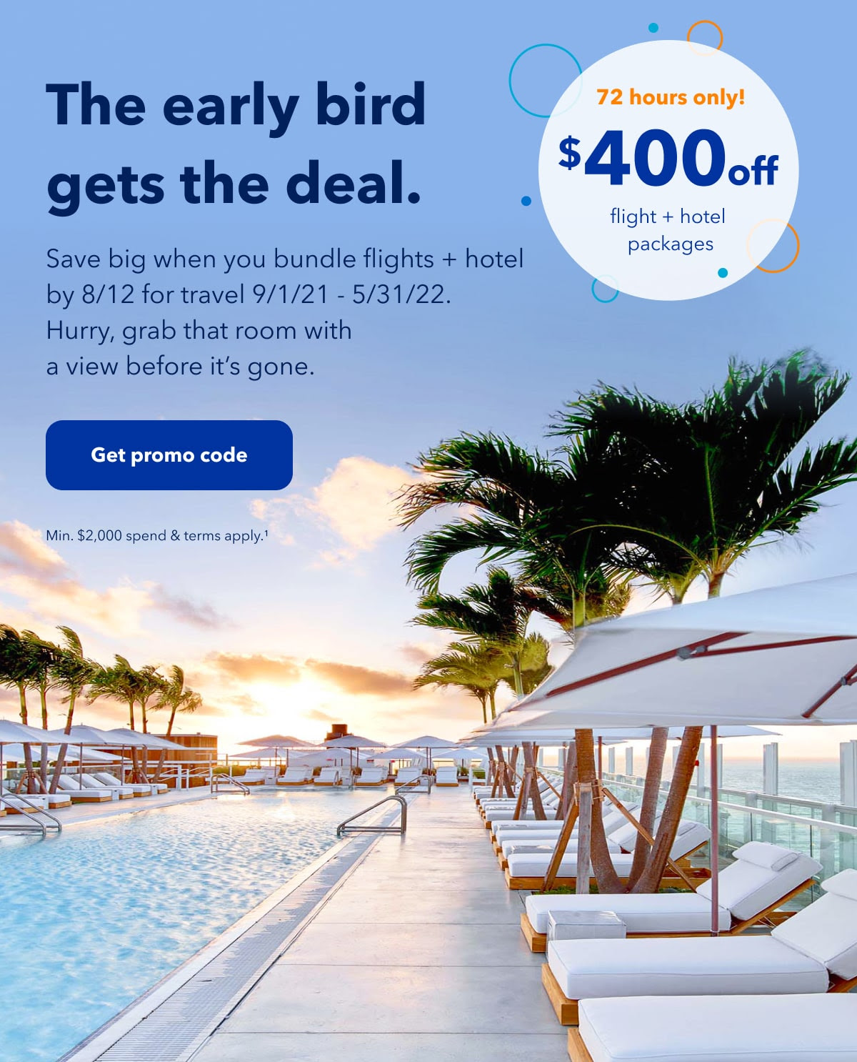
What I like about it: If the point of an email is to get you excited about some R+R, then this email from JetBlue takes the cake. The bright colors, clear skies, and lounge chairs get people thinking that could be them. And with the clock ticking down on the deal, JetBlue uses words like “hurry”, “72 hours only” and, my personal favorite, “The early bird gets the deal”, subtly prompting users to take action and book their flights.
Date sent: 08/10/2021



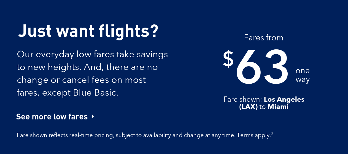
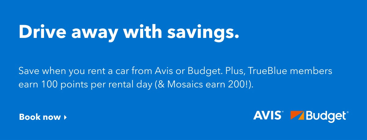
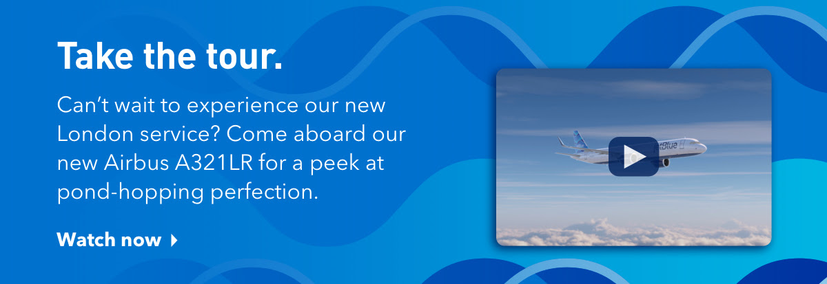
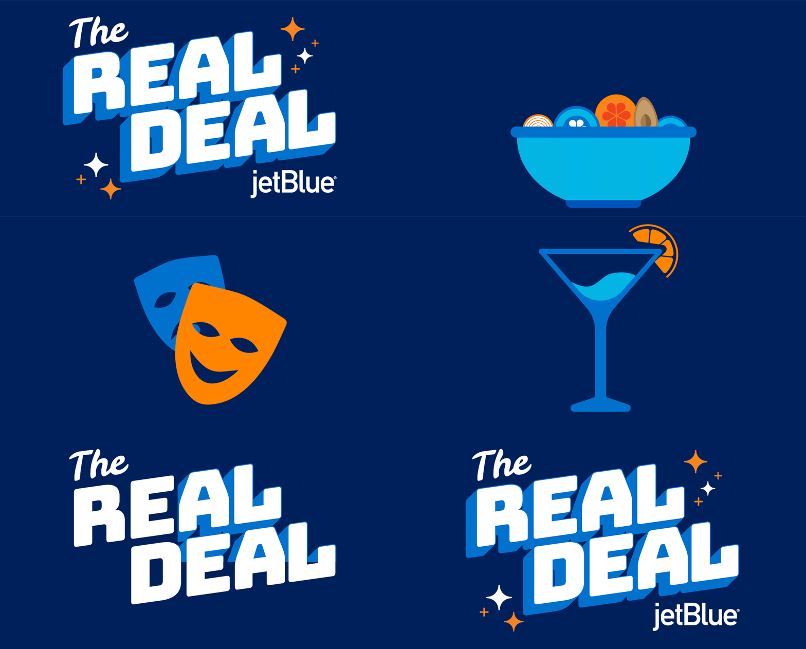
What I like about it: The one thing I love most about emails from JetBlue (including this one one) is their consistency. E.g. I know when I read their subject lines, the email content to follow won’t be far off – a simple practice that most brands seem to miss these days (aka click bait). I also love JetBlue’s use of the GIF in the email as a great way to get grab people attention and get them excited. The email is also broken up nicely and does a great job providing viewers with pertinent information and clear direction.
Date sent: 07/09/2021




8. Flip-flop, hooray
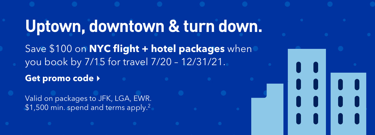
What I like about it: With summer approaching, JetBlue capitalizes on the change of seasons to reach out to customers with exclusive summer flights. Following the JetBlue brand, this email incorporates light hues of blue and is very nicely compartmentalized, guiding the viewers eye. The headline is also playful, the body copy provides additional value, and the CTA’s are clear and actionable. However, what makes this email from JetBlue so good isn’t just about what they include, but also what they don’t include – unnecessary amounts of information that distract users from the end goal: clicking the button(s).




9. Fall runway preview sale
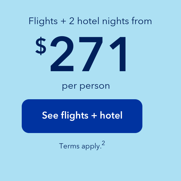
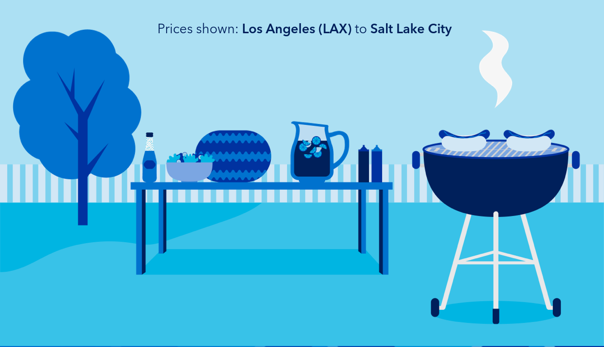
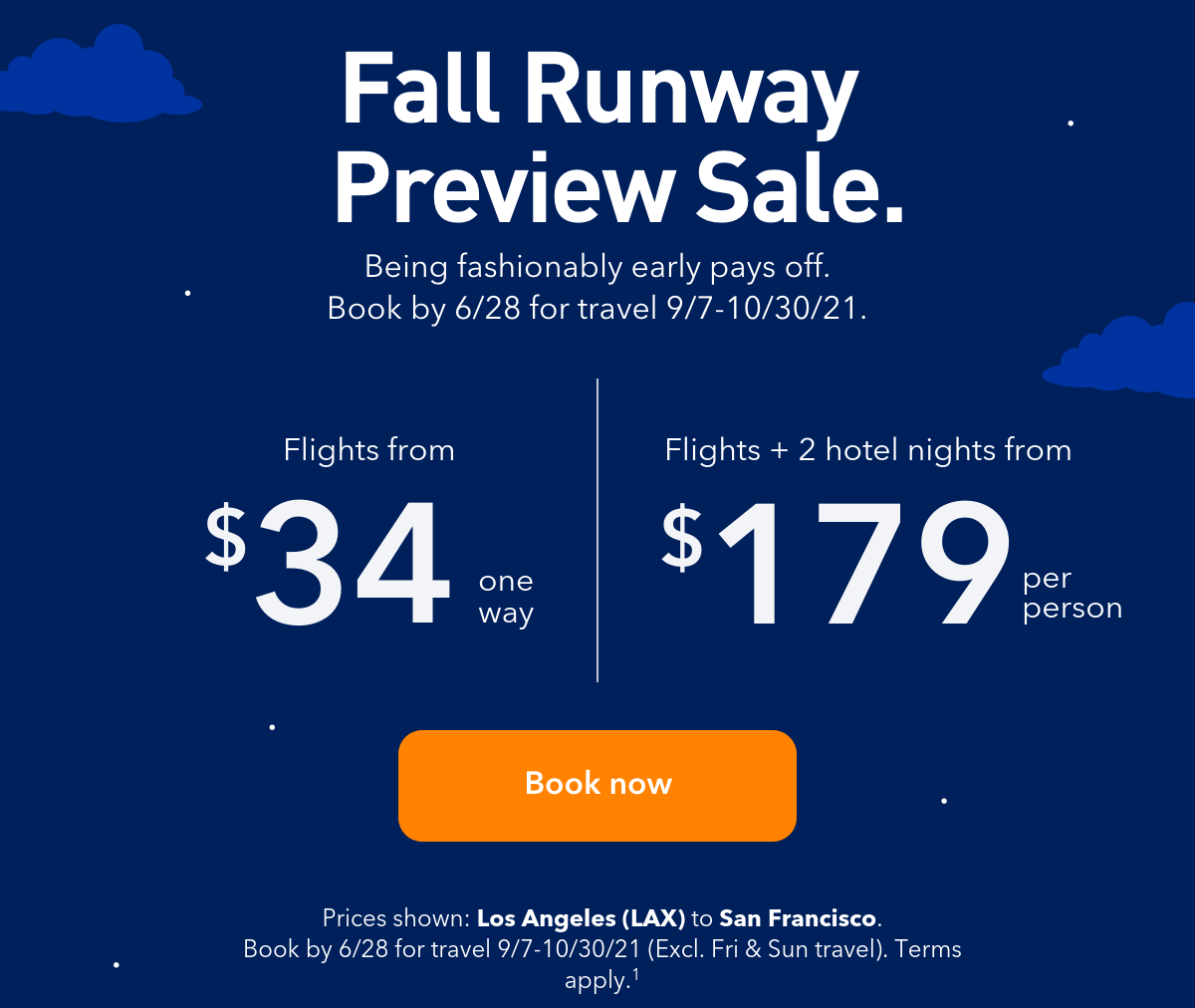
What I like about it: The runway awaits subscribers in this clever email campaign from JetBlue. The theme is clear, the messaging is consistent, and the imagery helps support the message(s) being conveyed. I also love the dark blue skies with the bright orange button that screams “click me”. And extra brownie points from JetBlue for seamlessly incorporating a section with flights to London that is consistent with the remainder of the email campaign.
Date sent: 05/27/2021





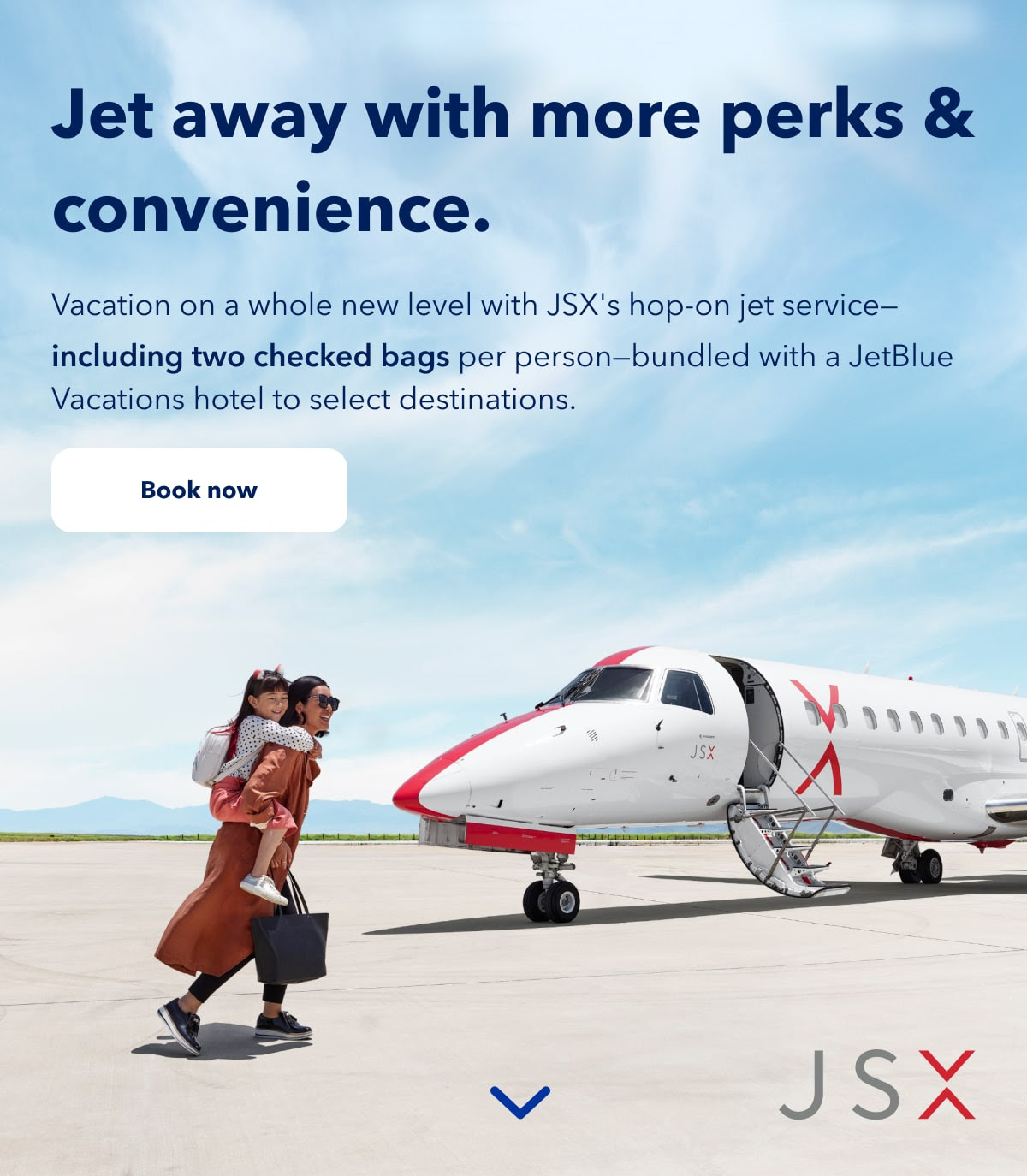
10. Jet away with more perks & convenience
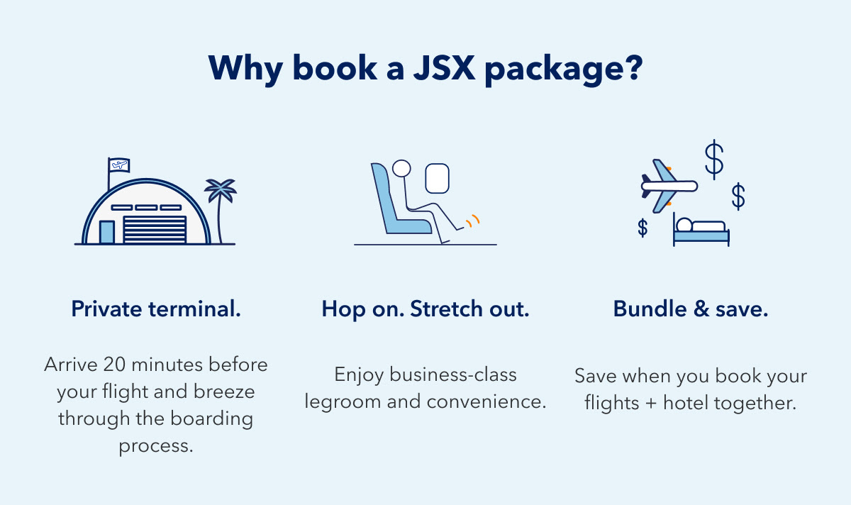
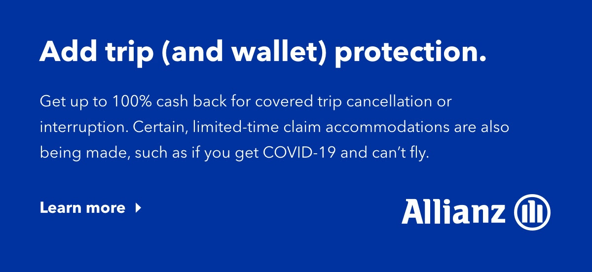
What I like about it: When coming up with value propositions for your email campaigns, it’s not easy to find images that tie it all together. After all, anyone can throw up stock images. But creating a feeling that evokes an emotion? Now that’s where the magic happen and where JetBlue does a great job with this email campaign. Couple that with a strong headline and three reasons to use their service and you have yourself a winning campaign. Kudos also to the use of the emoji in the subject line as it really sets the mood for what’s to come.
Date sent: 04/14/2021

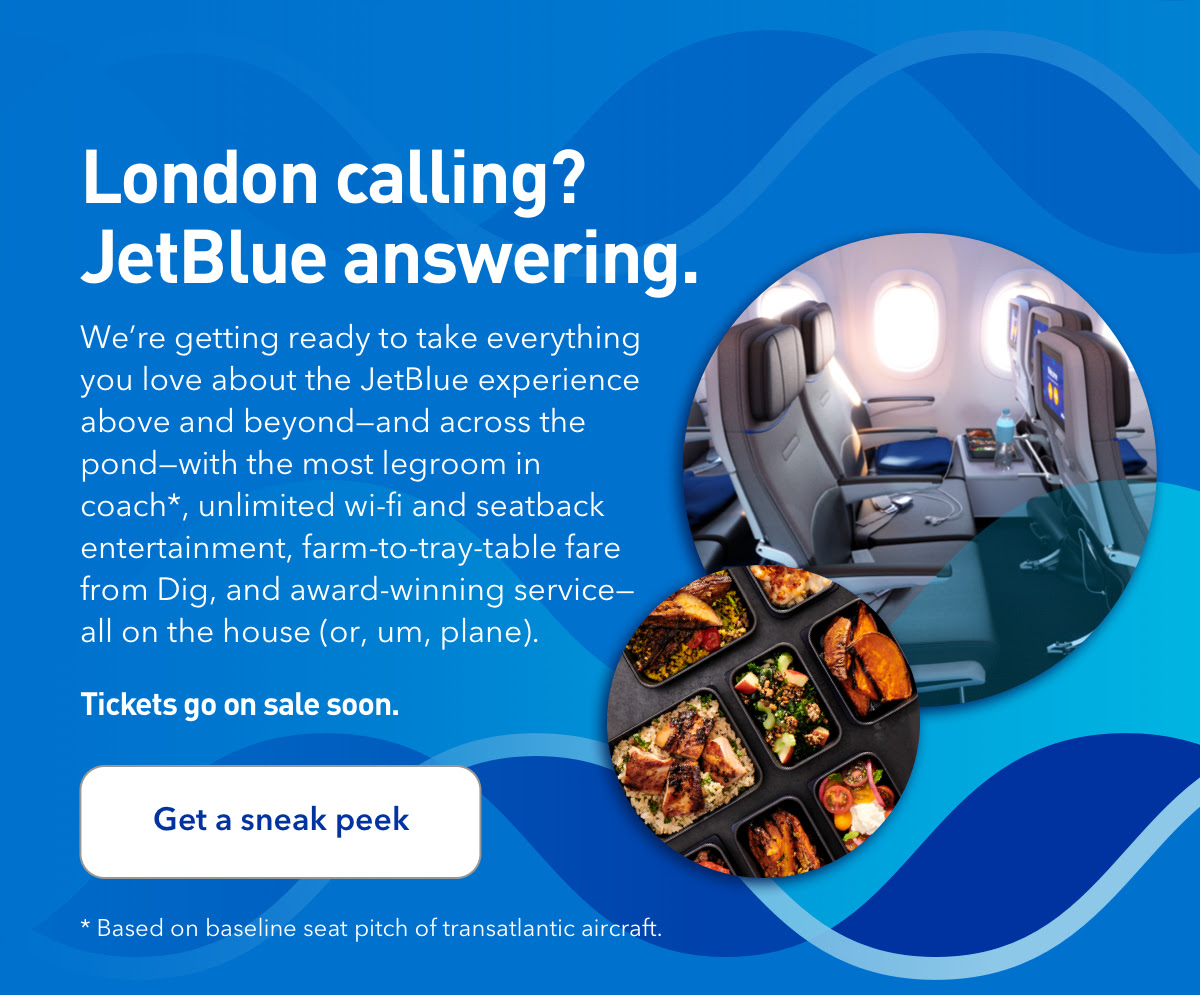
11. London calling? JetBlue answering.
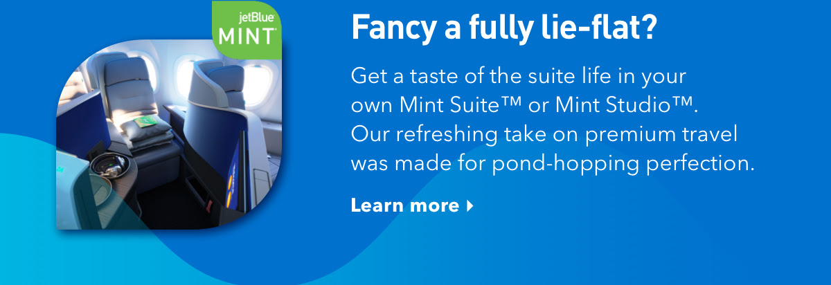
What I like about it: Atypical from the previous examples, this email campaign from JetBlue is as much persuading as it is fun. The email is led off with a witty subject line that strikes a bit of curiosity, which is a great technique to get subscribers to open your emails. From there, you are met with a well-thought-out headline and equally enticing body copy. You might even be tempted to call it ‘brilliant’. The email also does a fantastic job at including images that compliment the messaging, without visually separating any of the elements.
Date sent: 04/06/2021

Final thoughts
While JetBlue didn’t write the handbook on email design, they surely have mastered a few tactics that make their emails some of the best in the industry. From imagery and copywriting to layout and design, below are a few closing thoughts as to what I love about their email campaigns:
- Their emails connect visual design with a good, simple hierarchy. And by that I mean you are guided down the email without interruption or elements fighting for your attention.
- There is consistency across branding, website, and app experience. In other words, their website and email look and feel the same.
- Their emails are enjoyable because they surprise and delight. E.g. they seamlessly incorporate custom animated GIFs and go the extra mile on branding.
- They balance text, white space, and imagery. Not too much or too little of anything.
- Their emails are accessible across devices and screens. Whether viewed on a phone or desktop, everything can be clearly seen and digested.
- They write catchy subject lines that strike the right balance of curiosity and authenticity; so, subscribers are not fooled when they open their emails. No tricks or gimmicks.
When designing your next email campaign (whether it’s an automated series or one off promotional campaign), give yourself a checklist and, honestly, use JetBlue as your litmus test. Of course, your brand should have it’s own look and feel, but ask yourself these questions as you design your next email campaign: Does the subject line support what’s inside your email? Is there a strong value proposition? Is it digestible? Is there a sense of hierarchy? Can someone easily navigate through the email?
Final final thought
You should never assume that whoever is viewing your email will know what to look for. Navigate your audience. Give them clear direction on what you want them to do and what you are asking of them. And lastly, to the best of your ability, try not to incorporate more than one CTA. According to WordStream, emails with a single call-to-action increased clicks 371% and sales 1617%.
My m.o.
Make real connections and a difference wherever I go by listening and learning about people’s lives around me.
My favorite quote
"You can't change the world, but you can make a corner of it pretty nice." — William Chapelle
Connect
© 2022 Matthew Derreck Peters
